 A few weeks ago, my friend Jason Fox, redesigned my website to a “responsive” website. My site is now much easier to navigate, no matter what device visitors use.
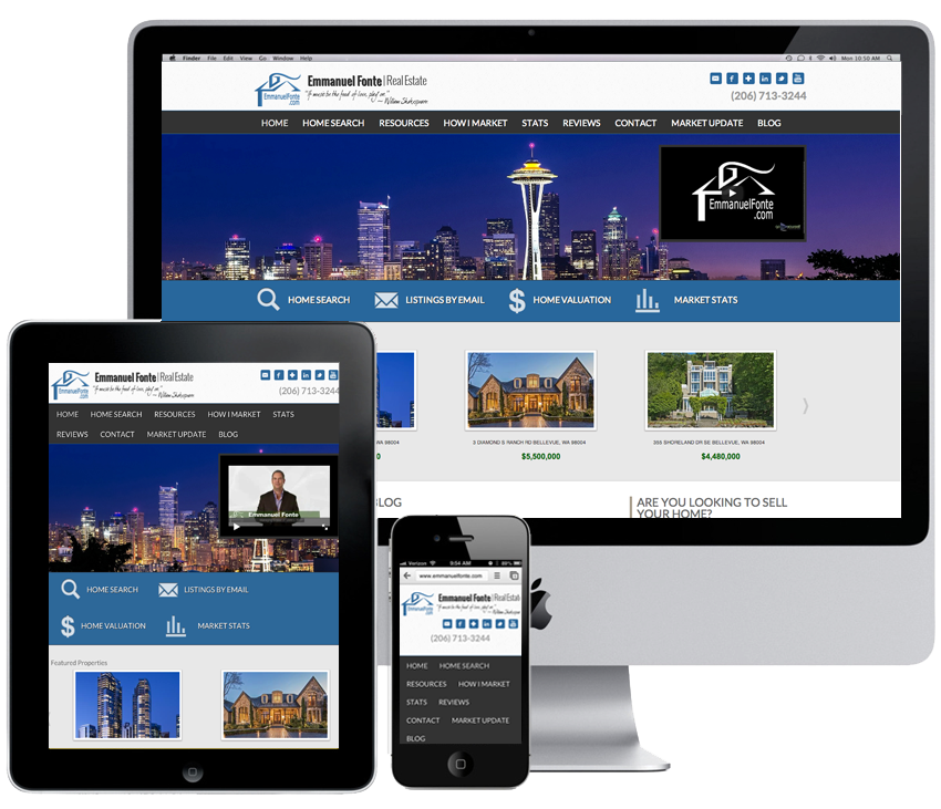
Responsive web design (often abbreviated to RWD) is a web design approach aimed at crafting sites to provide an optimal viewing experience—easy reading and navigation with a minimum of resizing, panning, and scrolling—across a wide range of devices (from desktop computer monitors to mobile phones) (Wikipedia.com)
Here’s Jason’s explanation: Responsive WordPress Design uses CSS media queries to trigger different layout sets at various screen sizes. No longer will you need to zoom and scroll around when browsing on your mobile phone. No longer will you need to use the WPTouch plugin to make a “Mobile Version” of your website.
In case you’re a visual learner (aren’t we all?), here’s an infographic for you.

Thank you for the shout out. That is one long Infographic… but very informative.