 As earthy or electric as you please, this yellow-green hue brings the zing or just freshness to homes from traditional to modern
It’s a vivid, electric color. Happy, even. It’s the inside of a perfect avocado, a bed of Scotch moss or the belly of a lovebird. Chartreuse is halfway between green and yellow — a yellowish green, a greenish yellow. But the spectrum within this color ranges from bright lime to light sulphur.
In its lighter, softer form chartreuse makes a great wall color for earthy, nature-inspired rooms. In its boldest, brightest form it is as eye catching as neon.
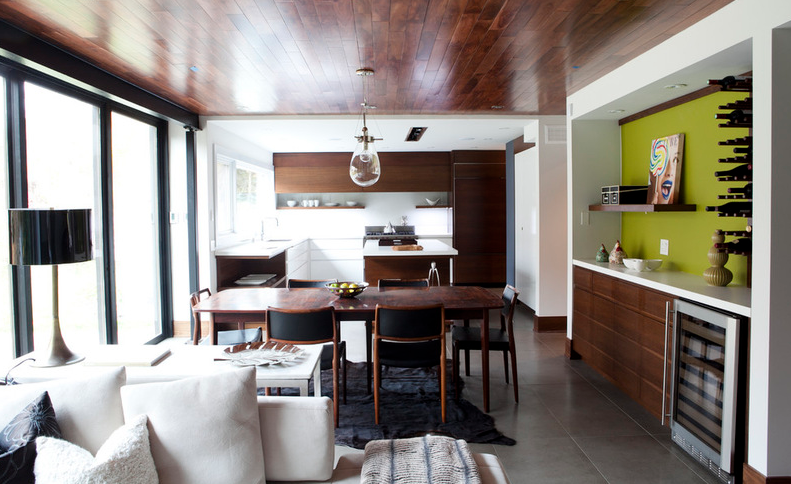
Chartreuse can be both earthy and electric. It looks wonderful with reds, oranges and blues, especially turquoise and cobalt. Bright chartreuse is a perfect foil for charcoal gray (think lichen on stone) and in modern design is often used as a pop against muted neutrals. It looks crisp and spring-y with bright white and vivid with purple.
It’s very popular in modern design, but chartreuse can span the eras and does not need to be used sparingly. Go ahead and put it all over; it can take it. Do you want a baroque entryway with chartreuse walls and crystal chandeliers? Go for it.
As these photos show, chartreuse may be bold — flashy, even — but it is not limiting. In fact, it’s an all-around great decorating color.
Speak Your Mind
You must be logged in to post a comment.