
Often when you first buy a house or decide to remodel your home you need to evaluate the colors used throughout the house, which rooms you plan on painting, and what order to wish to paint. Using a floor plan with each room’s wall color represented can help you get a feel for your current color scheme as well planning for future upgrades.
Home remodeling blog Young House Love recommends using a floor plan tool such as Floorplanner, but if you already have a copy of the floor plan it’s probably just as easy to use an image editor like Photoshop or GIMP to add the colors in.
Painting the walls with a hip color can be a great way of making a new house or apartment your own inexpensively. If you want to coordinate the design in most of your rooms you may want to consider using the color palette technique.
Paint can pretty much be chalked up to a learning experience around Casa Petersik. From painting all of our home’s trim with flat paint right after we moved in (baaad idea, use semi-gloss!) to picking a different color of the rainbow for each room (not the way to make a small house flow!) we’ve pretty much made every mistake in the book. And over the last almost-four years our walls have definitely “evolved” as we learned what we liked (and a whole lot of what we didn’t).
We decided to use a handy little floor plan (created thanks to Floorplanner) to demonstrate three “stages” of our home’s ever changing color scheme to show that homes don’t usually “magically come together” overnight. Sometimes it takes some experimentation and a bit of repainting (and repainting again) to get ‘er done. But with every little change that you make you’ll be inching towards the home of your dreams- and just like the right dress can theoretically make you look slimmer and bring out your eyes, the right wall color really can turn any house into a dream home (all for about $30 a room and an afternoon of your time).
Here’s what we meant when we mentioned that we picked nearly every color in the rainbow for our house’s original color scheme right after we moved in…
Color Scheme: THEN

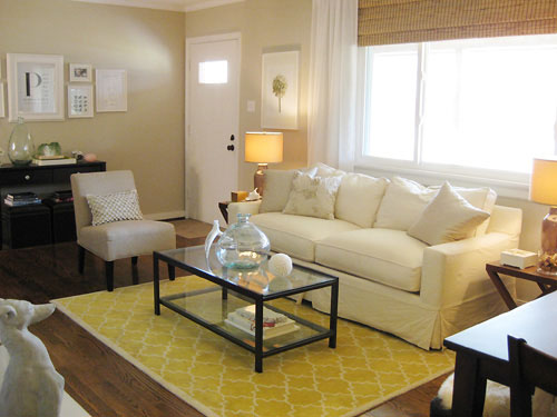
From an orangy-yellow in the den to an easter-egg-ish pastel green for the living room, our choices really ran the gamut. And we even went with a bright robin’s egg blue for the third bedroom (which was formerly the dining room) and the half bath. Of course looking back those were odd choices for two of the smallest rooms in our house. In short: when this color scheme was in effect, it felt like you were entering a different house every time you stepped into a different room instead of feeling like there was an overall cohesion and flow to our modestly sized ranch home.
The funny thing is that the only color that we chose to use twice was the bold turquoise color in the 3rd bedroom and the 1/2 bath. Now we understand that in a small house you want continuity and rooms that feel like they flow- and not like they’re chopped up with different color schemes- so we routinely repeat colors or slide a shade or two darker or lighter to keep things feeling related throughout our entire home’s floor plan. Then we chose to repeat the soft blue-gray bedroom color in the kitchen while keeping the rest of the house subdued and neutral, and stood back and admired how the creams, sandy tans, and soft gray-blues worked together to create spaces that felt varied and interesting without evoking that chaotic and unrelated vibe.
Color Scheme: MIDPOINT

Only the master bedroom and the sunroom escaped the repainting massacre that took us from the “then” paint color breakdown to this “midpoint” diagram above. And while it may not look exciting on screen – it totally made the house feel bigger, more connected and a lot more grown up. What we had done was accomplish a more toned down and agreeable whole house palette, but we still ached for something a bit more interesting and textural (nothing too high contrast, but just a few unexpected paint color applications to keep things feeling fresh) so we did a few things to take our house from serene and soft to serene and soft… with a bit of a twist.
Color Scheme: NOW

It wasn’t anything too major, but we definitely made a few noteworthy and fun little tweaks none the less (and the few changes that we’re about to list earn us BY FAR the most paint color compliments, so it really does pay to go that extra mile):
1. We painted the ceiling of the blue-gray master bedroom a softer more subtle blue-green tone to create a dreamy ambiance that far surpasses the magic of a white ceiling. Read more about this project here.

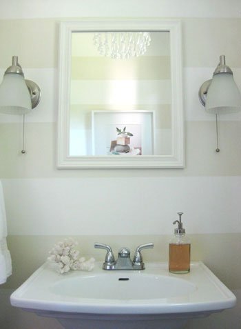
2. We added playful tone on tone horizontal stripes to the half bathroom in a few hours one evening (for under five dollars). Best time and money we ever spent. Read more about this project here.
3. We took the full bathroom from the same color as the living room and guest bedroom to a soft khaki green color (since they were all in such close proximity this added a nice varied feeling to a layout that was feeling a bit tan on tan on tan before). And we even carried the same wall color right up onto the ceiling for a seamless effect. Read more about this project here.

4. We chose a cheerful pear color for the walls of the newly created nursery and added a splash of soft aqua on the ceiling (the blue ceiling tied into the master bedroom and the kitchen while the green walls related to the nearby khaki green bathroom and a slew of green accessories throughout the house). Read more about this project here (and see additional photos here and here).

And we’re not done yet. Homeownership is an ever evolving process, I tell ya. Next on the agenda: nixing our white ceilings. We know they’ll feel higher and a lot less stark and jarring when they’re better integrated into our home’s palette. In fact, we’re planning to paint almost every single one in either a lighter tone of the wall color (they’ll still feel lifted but not quite as stark),
the same exact hue as the walls (if the walls are light enough this really blurs the bounds of the room and makes it feel a lot more expansive), or even a contrasting or complementary color (we’ve always wanted to paint our tan sunroom’s ceiling sky blue).
So that’s where we are at the present time when it comes to our home’s state of paint affairs. And since we know you guys love all the dirty details, here’s a quick rundown of our casa’s current colors:
- Master Bedroom: Glidden’s Gentle Tide (walls) and Glidden’s Cool Cucumber (ceiling)
- Second Bedroom: Glidden’s Sand White
- Full Bathroom: Benjamin Moore’s Dune Grass (color matched to Olympic’s Premium No-VOC paint)
- Nursery: Mythic’s Autumn Bloom (walls) and Mythic’s Adanna Aire (ceiling)
- Living Room: Glidden’s Sand White
- Kitchen: Glidden’s Gentle Tide
- Den: Glidden’s Water Chestnut (fireplace accent wall) and Glidden’s Wishes (other three walls)
- Laundry Nook: Glidden’s Wishes
- Half Bathroom: Glidden’s Wishes (walls) and Valspar’s Honeymilk (stripes and ceiling)
- Sunroom: Glidden’s Water Chestnut
- All Trim & Interior Doors: Freshaire’s No-VOC stock white semi-gloss paint
Note: Some of the Glidden colors listed above are no longer available, but they can supposedly look up the formulas on the computer and whip them up for you. If not, Glidden’s Wishes is now called Eloquent Ivory (it’s the same exact formula), Benjamin Moore’s Quiet Moments is very similar to Glidden’s Gentle Tide and Benjamin Moore’s Ashen Tan is very close to Glidden’s Sand White.
And why stop now when there are more things we can add bullets to? Here are few of the major paint discoveries that we made along the way. Here’s hoping they help you sleuth out the perfect color palette for your casa:
- Never select a color without checking it out in morning light, afternoon light and evening light- just to be sure it doesn’t mutate from serene to scary when the sun sets.
- Paint colors look completely different in different spaces, so don’t blindly paint your room a color that you liked on the walls of Restoration Hardware since their lighting is nothing like yours. Instead bring home the paint chip, tape it up on your wall and check it out in your lighting at all times of the day.
- Always look at a paint swatch on the plane that it’ll be on (don’t put it on a table and look at it horizontally if it’ll be on the wall- actually tape it up on the wall and evaluate it there- the same goes for ceilings).

- Taping up a few paint chips at a time can help you select the perfect shade (since you can compare them to one another, you can much more easily weed out anything that’s “too yellow” or “too peachy” thanks to the other swatches beside it).
- We usually gravitate to the bottom two swatches of every paint chip (since our house is modestly sized we like how lighter tones and shades of each color make our house feel more airy and expansive).
- Neutrals can be written off as boring, but with crisp white trim and a range of furnishings, accessories, and textiles layered into the space they can be anything but.
- Repeating a color across the house isn’t weird- it’s smart. Making your master bedroom the same color as your entryway is a great way to take your house “full circle” so things feel like they’re part of a bigger picture. We use 80% of our home’s colors in at least two spaces (sometimes three) and the result is a nice layered and serene feeling.
- When you don’t want to repeat the same exact color, sliding one tone lighter or darker on the paint swatch is a great way to guarantee that rooms will feel related and airy (ex: go a shade lighter in your master bathroom than you did in the master bedroom for varied interest that still feels cohesive).
- There have to be colors that you always gravitate towards (in our case, green and blue) so using muddy and subtle variations of those tones along with a nice liberal dose of neutrals is a pretty foolproof formula.
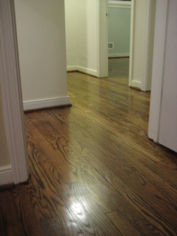
- Keeping the flooring (ex: mocha hardwoods) or the trim (ex: crisp white) consistent in as much of your home as possible will really help to unify any home’s color scheme.
- Even smaller items- like a leafy green plant in each room- or similarly colored wall frames- ours are all white- can really tie disparate rooms together for a nice easy flow.
- Don’t forget that tan and beige aren’t the only neutrals! Cream is a gorgeous alternative for a hallway (especially if you have a bunch of rooms branching off of that space and want something unifying and not too bold) and there are many light platinum gray tones that are luxe and chic without being too dark and brooding.
- In general (although definitely not in all circumstances) we like accent walls that are subtle as opposed to jarring and high-contrast (since the later can break up a space and define the boundaries of it, thereby making it feel fractionalized and disturbing the easy flow).
So that does it for our yeah-we-make-mistakes-too-and-learn-as-we-go-and-repaint-rooms-a-few-times-to-get-things-right post. It definitely helps to remember that paint is the cheapest mistake you can make! So stop being paralyzed by indecision and just dive in. If you pick the right color you’ll be over the moon, and even if it’s wrong you’ll learn what you don’t like so you’re closer to scooping up the perfect shade… and you’ll only be out around $20-30 bucks. Happy painting to you and yours!
Speak Your Mind